
(This is a expanded archiving of something I posted over on Mastodon. You can find it here.)
TL;DR: I love blurred and grain/noise textured wallpapers, and think should be way more extended in the UX scene, because:
- gradients/colour blends are extremely soothing and can represent a bunch of moods;
- they are recreational enough but not overly distracting;
- they are easier to balance/fine-tune/customise/re-flavor colour-wise than high-detail images;
- a bit of noise filter adds texture/grain that feels very satisfying (borderline ASMR/synaesthesia);
- they are way more scaling-resilient and therefore resolution-agnostic. Higher resolution/DPI, or a larger screen? No matter; they will further blur themselves into place (:
And I think they do have a niche to fill in UI/UX: modularity, ability to be procedurally generated, ability to change with accent colours/mood/hour of the day, and overall an extra, system-wise aspect of customisation for the user.
I love changing the UI of my devices as much as I can, but I’ve grown quite comfortable over the years with the default aspects. Perhaps because the latest trends are aligning with my tastes, perhaps because UI/UX aspects of the Linux Desktop have developed dramatically in the last decade; perhaps because I am lazier and cosier around what I know… (probably a mix of all).
That leaves one thing: wallpapers. But the trend is not different here. I have also grown used to the same wallpapers over the years. As the Millennial digital hoarder I am, I have gathered a wallpaper collection of more than 6000 images since my mid teens. From these I have been using the same wallpaper, or rather the small collection of curated wallpapers, for around 8-9 years practically without interruption (i.e.: in one way or another, in one device or another, without long time stretches of wallpaper-jumping in between).
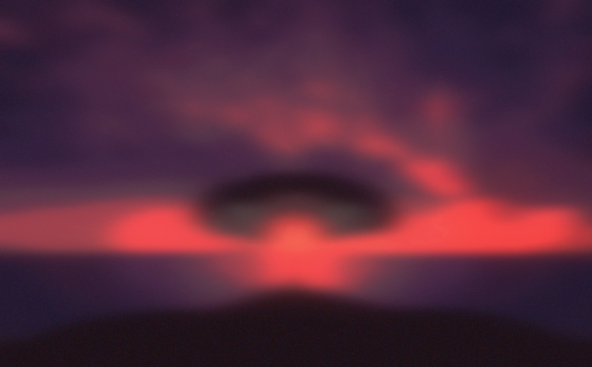
What is so special about them? I would say nothing in particular. You can see the main one here:
That right there is a blurred version of ‘Sunset Over Pichola Lake in Rajasthan‘ by Mick Roessler, a photograph whose original author and reference I only found recently. You may also know it from somewhere else, just like I did at the time. It was included in the collection of default wallpapers from Windows XP. I loved the blazing, otherworldly colours (and I still do), but at the time I was sad I could not use this in my computer because of the low resolution of the picture. At that time I was also jumping around different abstract wallpapers in the likeness of the default ones in Mac OS X pre-Leopard, or Windows Aero, which also played around with colour gradients and blurring.
I remembered this trick from an IT teacher I had at High school: make a 2×3 pixels image, fill each pixel with a colour of your liking, and set as an expanded wallpaper. The OS’s (at the time, Windows) effort to stretch the image would turn the little pixels into a multi-colour blend or gradient. So, thinking of an abstract blurring as a trade off between scalability and loss of detail, I had the idea of “pixelize and re-scale”. If I remember correctly (it’s been years), first I shrank it to ~160×240, I downsampled the colour palette to 16 colours only, and re-scale massively, to around 1980×2560 or something like that, using cubic interpolation. The result you can see for yourself.
The second part, the “noise” texture thingy, is not part of the picture you have seen. But the idea is, after re-scaling to the resolution of your liking, you can apply a soft filter of RGB/Gaussian noise to add a subtle feeling of “film grain” that can really pull some of the effect of texture and comfort from analogue material.
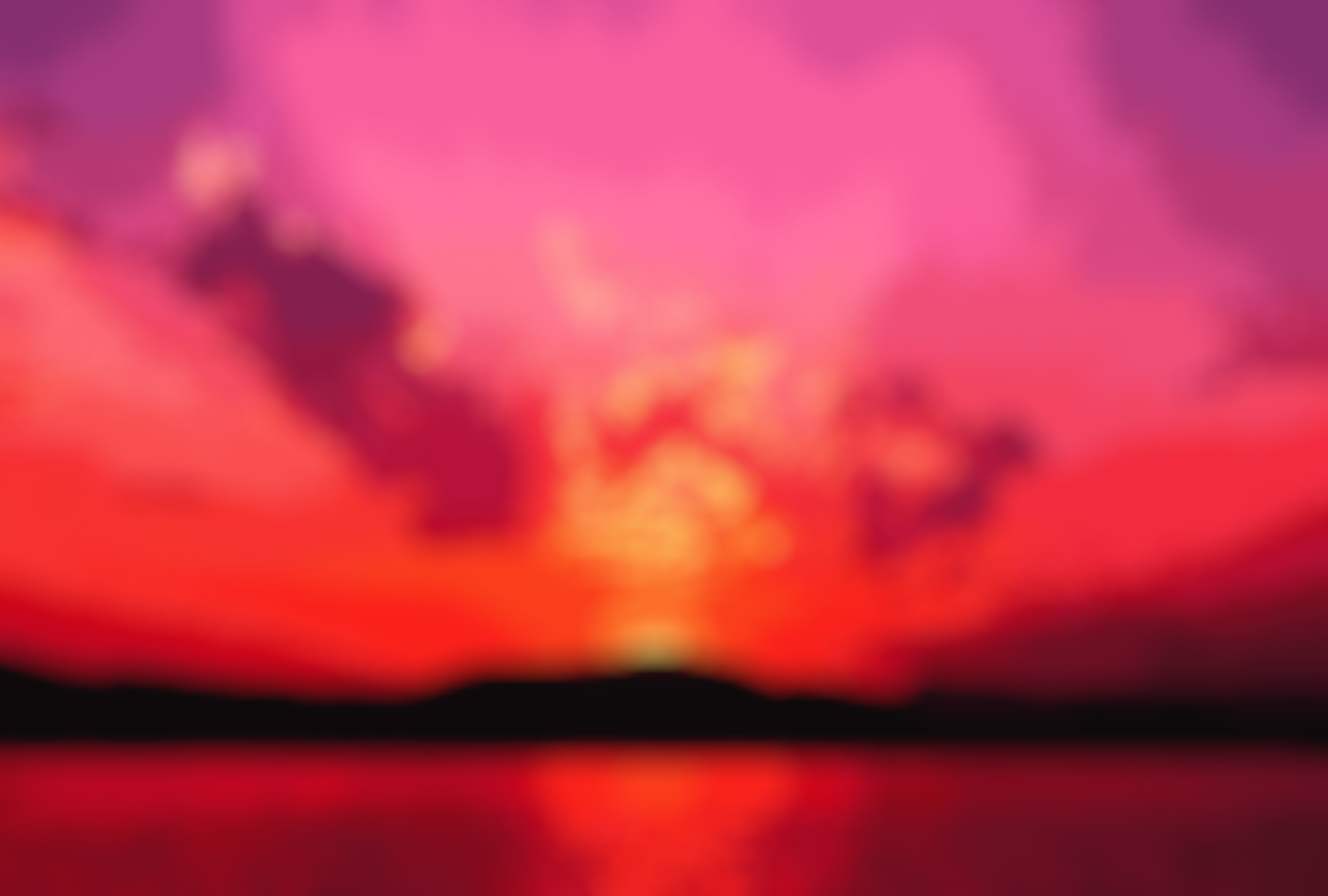
So, my (not-so-)new favourite thing are blurred+noise texture wallpapers. And lately I have been going and coming back to them, with some examples of blurring as recent as last week.
Why do I like them so much?
- Gradients and colour blends are generally very soothing compared to other pictures (I believe because they emulate things like dawn and dusk lights), and can be used to convey a bunch of moods. This combination of soothing and versatility are very appealing to me. The fact that most of the times our apps and work take up most of the space, made me realise I do not really miss looking at a specific picture and would rather use that bit of time to have a look at pretty colours.
- They allow recreation but are not overly distracting. Their faded nature makes them an easy spot where to rest our sight compared to other elements of the interface, even if they come from actual photos or illustrations that we might have blurred.
- Because of their simple nature, it is potentially easier to tweak (i.e. change colouring etc) and remix a pre-made gradient wallpaper compared to highly detailed images where different sources of light, textures and whatnot make for a lot of colour complexity that might not be easy to balance. I like to think about the light/dark mode wallpaper duos that abound in recent UIs.
- A bit of noise filter on top of these gradients, if properly done, can add an extra nuance of texture or grain which —-to me— are also very relaxing to look at. Much like old pictures.
- And last but not least: because of their blurry nature, these wallpapers are way more scaling-resilient and therefore resolution-agnostic. As a regular user of these wallpapers for literal years, I can assure that they further blur themselves into place in different screen sizes.
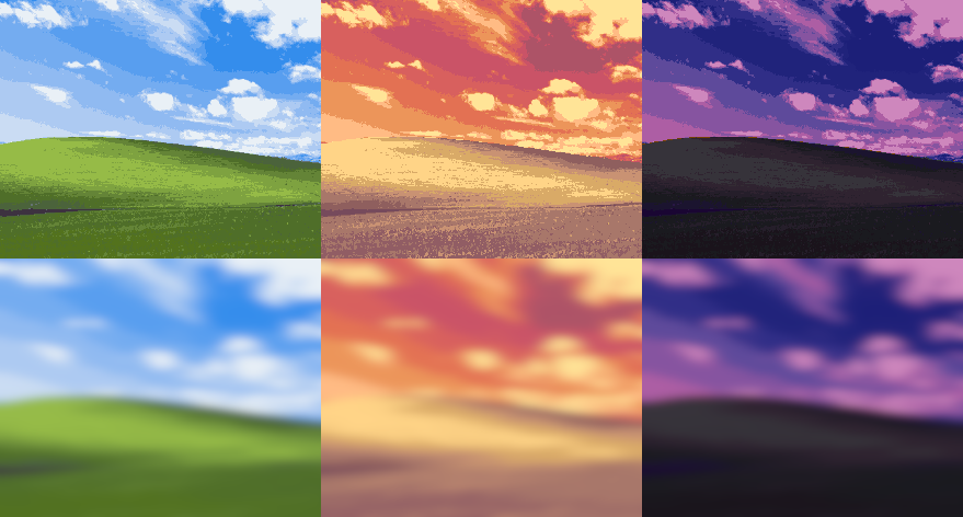
Below you can see, on a silly and quick example, how I scaled and indexed (half-toned) the Bliss wallpaper from Windows XP. After this I played around with the different colour palettes to make a sunset and dusk variants, and after blurring the imperfections go away and all that remain are nice colour blends in the shape we are all so used to see. In a way, this indexing and recolouring reminds me of old video game pre-renders.
I really, really think that blurred wallpapers do have a niche to fill in the world of UX. They can provide a somewhat more abstract or agnostic alternative while keeping the personality aspect that might come with, say, the color accents of choice. I guess they could potentially be procedurally generated and change depending to accent colors, hour of the day (or night), moods of the user, etc. I wish to see more examples and discussion on things like these with time. Until then, I’ll keep using the ones I do for myself.