I’ve been enjoying the wonders of Pokemon decomp ROM hacking for a couple of years now, and some of my favourite works are those who effort into bringing Quality-Of-Life and novel features into old games. (I wouldn’t call them old as I played them when I was a kid, but alas, time passes and the Game Boy Advance is considered vintage now). Honorable mentions in this front include ShockSlayer’s Crystal Clear and the most recent Pokemon Crystal Legacy, both for Gen2 and aiming for compatibility with vanilla games such as Stadium/Stadium 2. For Gen 3 (Ruby/Sapphire, Emerald, and FireRed/LeafGreen, a.k.a. the best generation), Project Heliodor is doing a bit of the same by maximising completionism while allowing the generation of legal mons using complex and elegant RNG and PID handling. All of this, again, while keeping the whole experience mostly untouched and allowing for game save compatibility.
But Heliodor will at some point depart a bit from this and start including other features that would preclude game save compatibility, and in this regard I have thought of leaving here the core set of ideas that, in my opinion, would give Gen3 the ultimate experience and make it enjoyable for many more years to come. For practicality, I will focus on Emerald as it was the last one to be released. Suffice to say that these ideas are mostly shaped/inspired/taken by Heliodor and Emerald cross as I have played these games and I am a bit familiar with their features. I’ve tried to mention these everywhere I grabbed ideas from these projects in order to credit the original people.
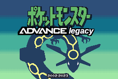
The name for this shapeless blob of ideas would be “Pokemon Advance Legacy”, or “(Pokemon) Ultimate Advance Legacy”. Below follows a manifesto of what my dream legacy Gen3 ROM would be like, mostly taken from what’s already out there in projects like Heliodor but also bits and pieces of my own.
Continue reading →


